Extra Plotting Utilities + Styles
Getting plots to look right in Matplotlib can be extremely frustrating.
PyARPES also has different styles from the matplotlib default. You can opt into them with
import matplotlib.pyplot as plt
plt.style.use(['seaborn-white', 'arpes'])
However, you will need to install seaborn first in order to override these styles.
The ARPES style file can be found in the root of the repository as
arpes.mplstyle. You should copy this to the location matplotlib
expects and modify in order to suit your needs.
Fancy axis labels
If you manually make a figure, xarray will set axis labels to the
string values of the dimension names of your dataset. PyARPES is able to
determine a proper display axis label from the short label and the
context available in the data, and you can change all the labels in the
axes at once to better display values with
arpes.plotting.utils.fancy_labels
A standard plots:
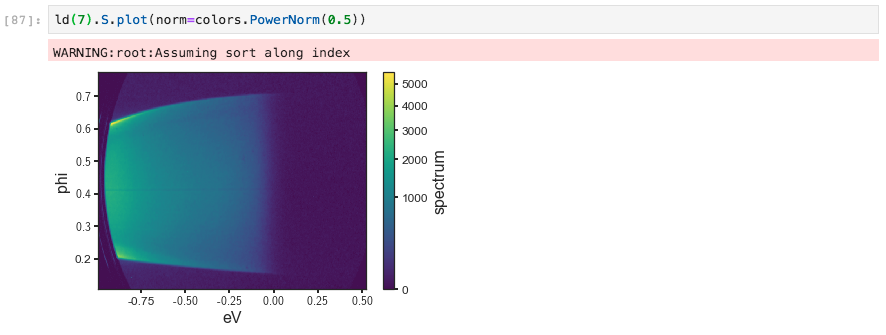
Without display labels
And now decorating with fancy_labels:
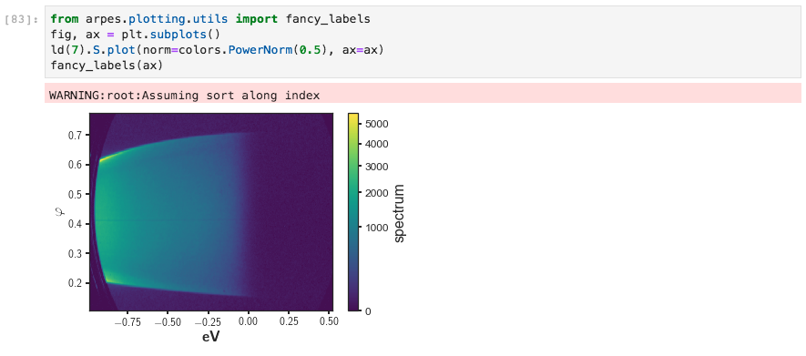
With display labels
Common axis formats
Setting up axes inordinately painful in matplotlib, but it’s also one of the keys to having excellent figures. Although there’s no substitute for setting things up exactly to your liking with GridSpec, PyARPES includes some practical options for common scenarios and hopes to accumulate many more.
As part of the plotting utilities, PyARPES has an axis standard for
displaying a density of states alongside an angle resolved spectrum,
dos_axes.
Colorbars
PyARPES associates some standard colorbars and colormaps with certain types of data. As an example, a percerptually uniform white and blues colorscale is used for temperature data, with a diverging white blue and red scale as an alternate, while a red blue colorbar is used for polarization data by default.
These colorchoices are used intelligently by the plotting code when producing flat stack plots or other colored line plots. Of course, you can also use them manually. As an example, you can look at the section describing stack plots.
Insets location references
PyARPES provides inset_locator to allow a figure to indicate which
portion of a larger dataset is used for a particular analysis. As an
example, we will plot a series of EDCs at different temperature,
normalized by a resolution broadened Fermi-Dirac distribution. The inset
locator gives the position of the EDCs on the Fermi surface.
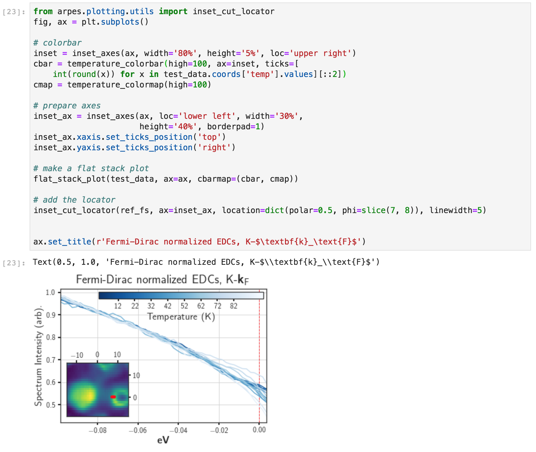
Inset locator on stack plot
In the case where location different dimension than the reference
data, the locator will plot a point, line, or region as appropriate.