Stack Plots
Stacked line plots, typically used to highlight some change in a lineshape as a function of an experimental degree of freedom or to better present the dispersion of a band, are among the most bread and butter of ARPES figures.
Because of their ubiquity, PyARPES offers two principal styles, differing in whether the lines are shifted and stacked, or all aligned but with varying color (often better for highlighting lineshape or gap change).
Traditional stack plots
You can get a stack plot with arpes.plotting.stack_dispersion_plot.
The scale can be adjusted with scale_factor=, and the axis along
which the data is stacked can be controlled with stack_axis=. Here
we will use the temperature dependent EDCs at the Fermi momentum from
our curve fitting explorations.
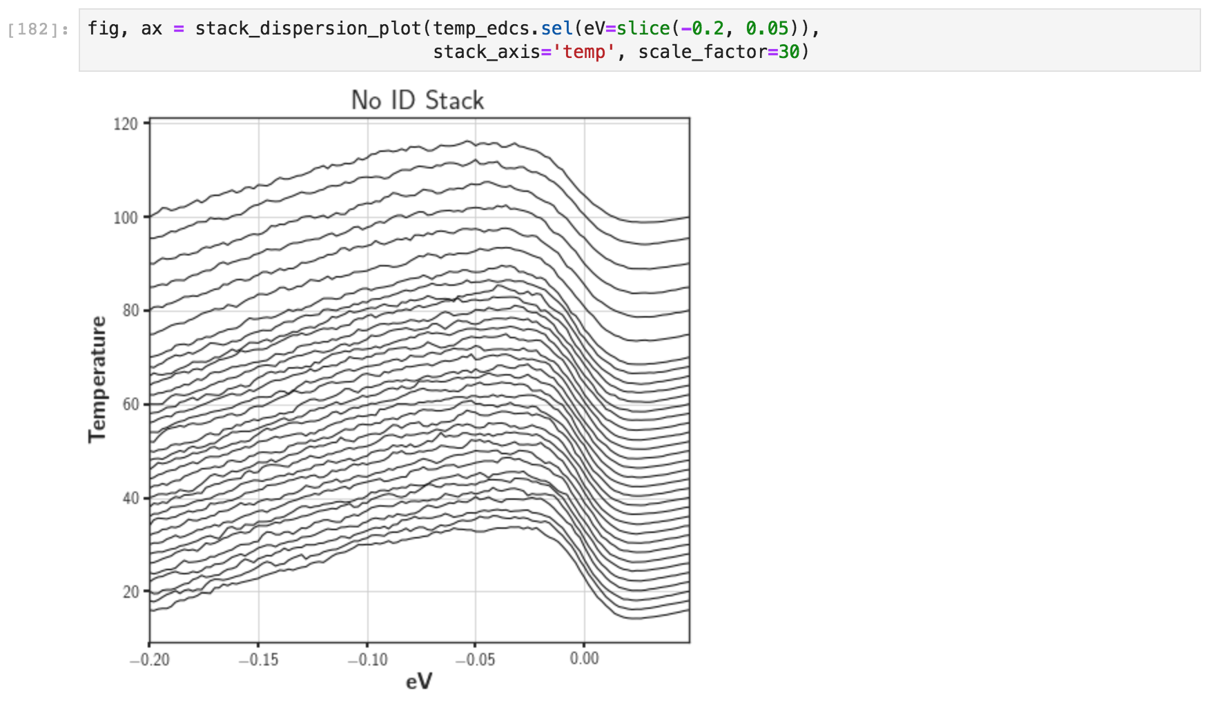
A traditional stack plot
To change the alignment characteristics to something more reasonable, we can request a constant offset, and snap the right side of the lines to the appropriate shift values.
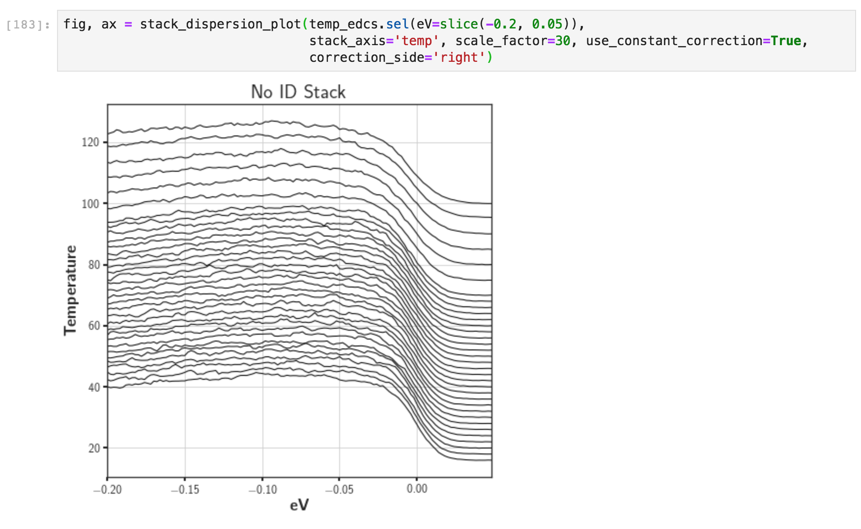
A right-aligned traditional stack plot
“Flat” stack plots
In addition to actually stacked line plots, we can opt to differentiate
the lines by color while keeping them overlapped. This can be
accomplished by arpes.plotting.flat_stack_plot, which acts very
similar to the above.
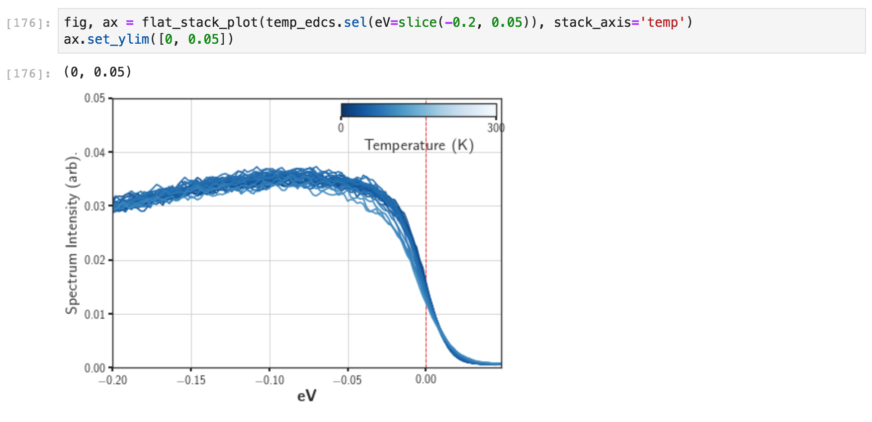
A flat stack plot
Although PyARPES will attempt to make a reasonable default guess for the
colorscale, here identifying that the stack axis is along the
experimental temperature and giving a colorbar from 0K to room
temperature, we can also control the colorbar and plot them onto custom
axes with cbarmap=. Utilities for colorbars are discussed
later.
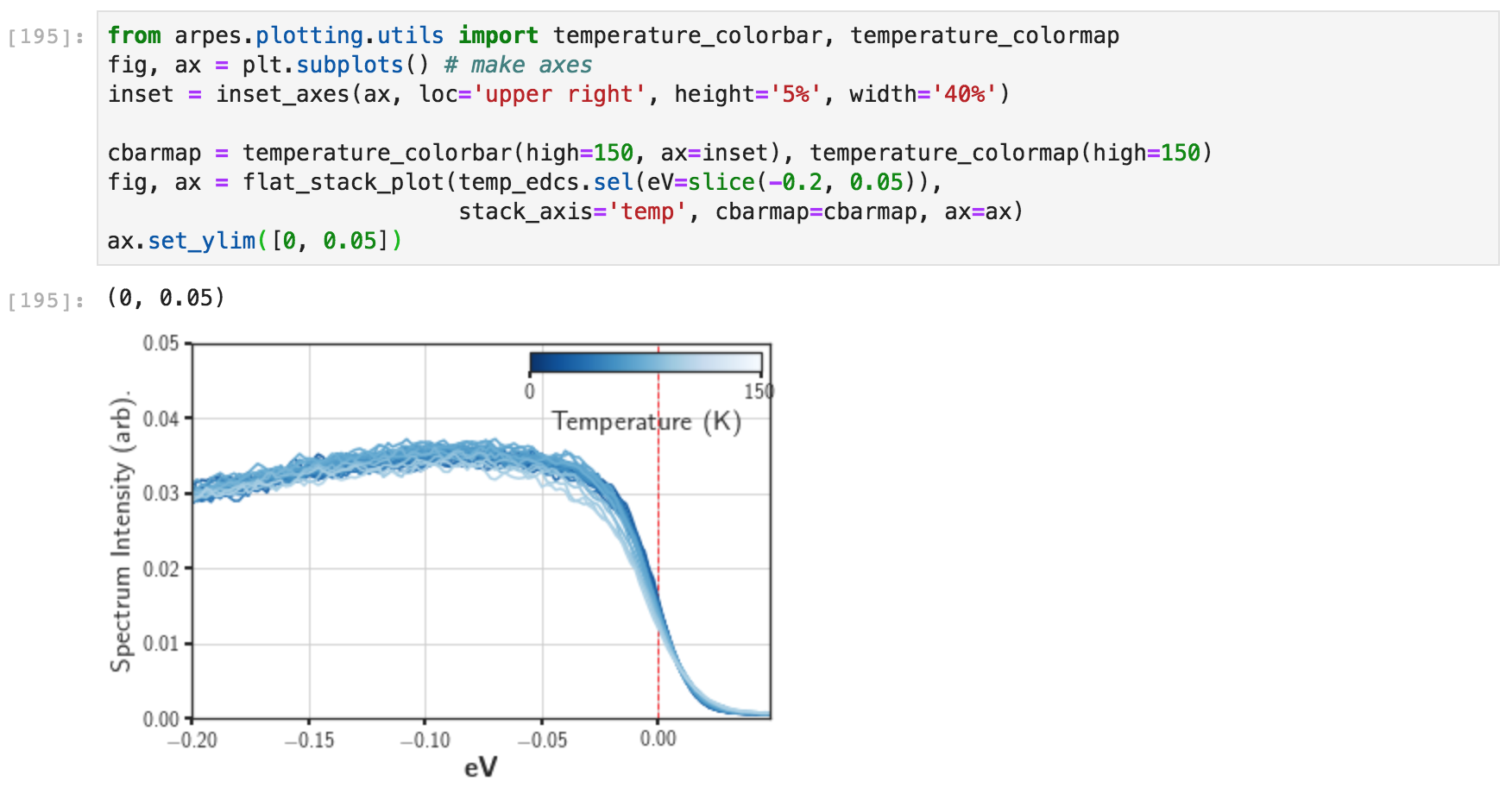
A flat stack plot with custom colorbar
Finally, as an example of how you might use the code in a real situation, we can do some preprocessing of the data before creating the figure. Here we subract and normalize by the low temperature data, which highlights the Fermi edge width changing.
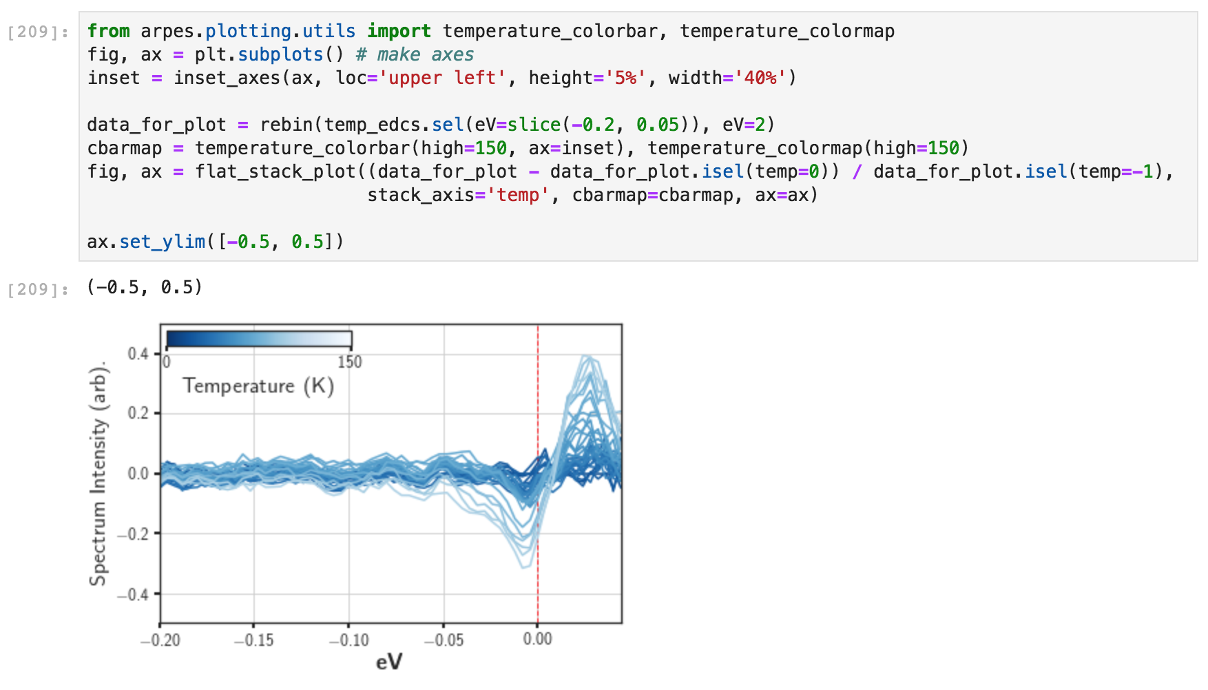
A flat stack plot with custom colorbar and data preprocessing